These days, people have too much choice of food to choose from. On every shelf and carrying bag, bright colors and bold statements vie for attention, and busy designs are everywhere. But there are many successful brands getting ahead of the trend. They are following a minimalist approach to food packaging, simple, clean and subtle. Minimalist packaging doesn't have to be dull and devoid of color; it can be a way to convey confidence, quality, and responsibility and make a brand more appealing. How it works and why it's important to the food business.
Clarity and Readability in a Noisy World
Minimalist packaging eliminates unnecessary elements, unnecessary text, multiple fonts, busy designs and multiple colors. All that's left is the core data, the brand name, the food type and maybe a single icon or small graphic. This transparency actually represents a competitive edge.
A customer is reading a display on a refrigerated shelf or looking at listings on a delivery app, and their focus level is measured in seconds. A clean and white lunch box, simple and elegant with just one word to describe it (“Salad,” “Bowl,” “Noodles”) speaks a loud message. There is no doubt on the product and who is its manufacturer. Cluttered packaging, on the other hand, forces the consumer to work to find the brand name, understand the message and guess what is inside.
Clarity builds trust. Using minimal text and subtle design means that the brand has nothing to hide. The packaging graphics are not the main attraction, it's the food.
Perceived Quality and Premium Positioning
Minimalist packaging has its way of making consumers think that it is superior in quality. Restrained, elegant packaging seems to be the hallmark of high-end electronics, high-end skincare and fine spirits. The same mentality is applicable to food.
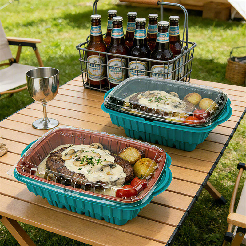
A lunch box made from high-clarity PET or RPET (recycled PET) with a smooth, flawless surface and a precisely fitting lid actaully feels premium. By contrast, a poorly produced box actually feels cheap. A neutral-colored (black, beige, or translucent white) PP container with a matte finish actually conveys sophistication. With a simple design, it is assumed that the brand has put funds into the food, rather than into fancy printing.
This perception enables food businesses to be able to charge more. A plain "minimalist" style box can be used to sell a salad for a meaningful amount more than the same salad in a generic, busy designed container. The packaging starts to add value to the product, rather than being an expense to be cut.
Alignment with Sustainability Values
Simple packaging goes hand-in-hand with eco-friendly practices. Fewer prints translates to fewer printing inks, coatings and chemical processes. Smaller or no labels is less material usage. Natural and neutral colors (white, beige, translucent) indicate eco friendliness without the need of a green claim.
Minimalist packaging is often used in tandem with sustainable materials, RPET that is recycled, PLA made from cornstarch and bagasse (sugarcane fiber) – which comes in a natural beige color and has a "fiber" feel to it. The materials are different from traditional plastic in both appearance and feel, and this change is beneficial. A bagasse lunch box isn't designed to resemble a white plastic lunch box, it's designed to exude its natural essence.
Minimalism and sustainability in packaging send a message of authenticity to consumers that value the environment. The brand isn't playing with pretty, pretty graphics that waste. It's stating its case for packaging as it states its case for food. This unity of visual design and environmental values creates strong brand loyalty.
Versatility Across Channels and Formats
Minimalist packaging is ideal for every occasion. It is quiet on a retail shelf, it's that way. It looks great in a delivery bag for social media, and customers enjoy and share photos of the clean and elegant takeout boxes. For a catered function, the minimalist containers are not distracting but appear professional and put together.
This versatility eliminates the need for several packaging lines. A minimalistic design can be used for dine in (when the box is taken to the table), takeaway, delivery and retail. The brand will find it easy to manage its inventory, have a uniform design, and save on design expenses.
Besides, minimalist packaging is more tolerant of variations during the manufacturing process. A hectic colourful print will display all colour differences and registration mistakes. The logo can be simple and it has only one or two colors, it is easier to be produced consistently, particularly by an OEM partner such as Xiamen Xiefa who can print custom logos on PP, RPET/PET, PLA, PS and other materials.
Summary
Minimalist packaging helps to build the brand appeal in four ways: clarity and readability in the crowded market, perceived quality and premium positioning, sustainability values alignment, and multi-purpose functionality for various sales channels. It conveys confidence, responsibility and respect for the attention of the customer. Xiamen Xiefa Vacuum Forming Packaging Co., Ltd, founded in 2009, delivers one-stop OEM/ODM minimalist custom packaging solutions which are based on PP, RPET/PET, bagasse, paper, cornstarch, PLA, PS and more other materials, and the processing technology is also certified by ISO 9001, BSCI, BRC, HACCP and GRS. Contact them now to learn how minimalism can take your food brand to the next level.